Showing posts with label Free Lunch Comics. Show all posts

Comic Book Review: Pork n' Beans #1

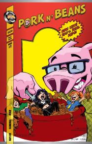
Pork n’ Beans (or Pork N’ Beans or Pork & Beans? I get a little confused about that…) is a fun humor comic about a pig named Norman that acts as caretaker for a household of hapless humans. Darcy, Leila, and Mike exist in this odd sort of age between 12 and 24. They act like young kids and they are referred to as kids, but Darcy and Leila have huge cleavage and Mike exhibits the kind of detachment that’s perfected only in the years following two decades of life.

But I guess that’s irrelevant, isn’t it? The point of Pork n’ Beans is to showcase the artistic talent of Matt Ryan, a kinetic and charismatic artist that’s an indie blend of Chris Bachalo and Jeff Matsuda. With that said, anything that blends the clever layouts of Bachalo and the expressive forms of Matsuda is bound to be enjoyable. The only drawback to the art is that it also has Bachalo's occasionally confusing compositions and Matsuda’s drastically angular tendencies. But more than anything else, the art is fun.

The writing by Darcy Naylor and Steve Kanaras is a mixed bag. The majority of the characterization is manic. That’s not bad. It’s just what it is. Some of the humor flows smoothly, while other gags are a bit jarring. Whenever something switches into a parody, it often becomes difficult to keep up with the joke. But when the gags all exist within the forward movement of the plot (and as opposed to diverging from the storyline) the humor is successfully passed from the writers to the readers.

The character personalities are fluid but I think I have a good idea of what we've got going on. I know that Darcy is goofy, Leila is the “straight man,” and Mike is the outlier (the Larry to his Three Stooges, if you will). Norman the Pig is like ALF but with responsibility and a bit of a grudge. All in all, I enjoyed this first issue. This comic book is a fun read with a lot of promise for even better stories in future issues.

6.5 / 10

Comic Book Review: Only in Whispers #1

This issue is a superb introduction to the Indie stylings of Free Lunch Comics. Only in Whispers #1 is an anthology book with tales of the supernatural. These stories take place in the past and the present, following characters both mundane and intriguing. Variety of tone is truly an asset of this issue. We experience freakish stories that carry their own individual flavors of eeriness. As a pleasant surprise, the different art styles contrast well with each other to produce a wonderful first issue.

To start off this collection of spooky tales, we witness a feud between a struggling writer and a potential Devil herself. Although the character context is somewhat open to interpretation, the strength of this particular story is that it sets the tone of this issue with excellence. Writer / editor / publisher Steve Kanaras works with artist / president Matt Ryan to tell this spooky story full of spiders. Hey, I love spiders so you know this sold me. I got a damn arachnid tattooed onto my shoulder so I better be down with this tale.

Next up is a somewhat confusing prose piece. Although I appreciate the attempt to mix in a bit of pulpy supernatural storytelling, this particular take didn’t do it for me. I feel like the momentum would have been best preserved by cutting straight to the next illustrated tale (which just happens to be the best of the book).

One Nibble at a Time, by Kanaras and artist Stephanie O’Donnell, is the best thing this book has to offer. The story follows a broken man who made a dark magic deal with a demon. It’s a hilarious interpretation of the “deal with the devil” concept. Makes me with that these two handled One More Day because at least I would have laughed my ass off. Imp, the hell spawn that helps take our protagonist to riches, is funny in an ALF-meets-Satan sort of way. My favorite moment of the story was watching the demon give the protagonist a high five on their way to glory. It was smart, irreverent, and smooth.

The next story is by Kanaras and artist Anthony Summey. The art is extremely strong in this tale, and so is the story’s concept. Rich with history, religion, and intrigue, these two creators immerse readers into a world of magic. It’s fascinating to see the way the story unfolds, especially if you’re a history buff.

The final illustrated piece is by writer / artist Andrew Pollock. His art style is like a fusion of Mike Mignola, Paco Medina, and Chris Bachalo. His visuals are cast in stark black and white images that emote with wonderful effect. His story deals with a haunting Banshee and a hunter determined to end the Banshee’s legacy of terror. The action was well choreographed, really expressing the violence of the battle. Artistically, this is the issue’s pinnacle.

At the end, we are treated to some prose tales of the supernatural, straight out of real life. I thought this was a terrific twist to the issue’s concept. I implore you – if you have a spooky real-life story to tell, share it with this comic book. All in all, this issue was a strong start for this Free Lunch Comics series.

7 / 10

Comic Book Review: Sky Pirates #1


This Free Lunch Comics tale is steeped in the shockingly rich fantasy history of the world of Valendor. Although this world will be new to most readers, the learning curve should dive up with excellent speed because the creators teach us what we need to know with quickness. Writer Everett Soares shows us what could easily be the far-flung future of our own Earth. In the year 3250 NA (stands for New Age), society lives much by an aristocracy / bandits model. But this aristocracy populates a world of flying ships, and these bandits count humanoid bears and cats among their numbers.

Our chief protagonist is Tobin, a man with a troubled history that’s well known for his ability as a Captain. We first meet him while he’s doing the nasty. See the title of this blog here? You know I liked that moment. And while I’m on a tangent, I was happy to see that this title didn’t shy away from sex. It embraced the sexuality of its characters, dispersing it in varying degrees to help define different personalities.

But back to our story. Tobin is tasked with going on a journey that could prove to be more danger than it’s worth. We the readers know this, but unfortunately Tobin does not. Accompanying him is the character with the best visual design in the book – his feline lover named Shyni. She’s a cat / human with a captivating composition. Her outfit and stripes work in seamless fashion to please the eyes.

Along for the ride are many other pirates, some to be trusted and others not. The first antagonist is established in the form of Gearz, obviously someone with whom Tobin has a past. This will prove to be an interesting relationship. Other members of the crew include many unknown pirates, as well as a large bear / man. His design is also quite eye-catching.

If I had to criticize the story’s structure at all, I would note that the opening couple scenes suffer from delaying the immediacy of the tale. By the time the issue is done, I feel fully entrenched in the fantasy experience of Sky Pirates. But I think it would have done this strong story much more justice if the creators had opened with an action sequence, and then cut to some of the more expositional moments instead.

The art team is decent, with a lot of excellent touches and a lot of room to grow. Penciler Brian Brinlee excels at forms. His characters are consistent, strong, and charismatic. Their motion could be more natural, but they compensate for that with their excellent designs. Brinlee is a great choice to introduce us to this world of Valendor. However, he does lack in the lighting department, leaving most of his work set out of the shadows. His line weights are also in need of greater variation, as they exist mostly as a standard thickness (and thus fail to create a tension of perspective within the panel). Inker Michael Kellar accentuates Brinlee’s strengths. Still, I would like to see more patches of black in his inks. Because the story is not inked with deep shadows, the tones by Jet Amago must compensate. While they do a decent job at making up for the lack of heavy darks they can’t fill the bill completely. Strong letters by Cary Kelley round out a fun Indie art team for this first issue. I look forward to watching the quality of their art grow as the series progresses.

Suffice to say that I’m hooked on Sky Pirates already. One issue deep and I’m already excited for the next installment. While there are a few structure and art concerns to be worked out, the immersive quality of this book makes the fantasy addictive. I can’t wait to read Sky Pirates #2.

6.5 / 10